The System Properties of STAMP Workbench can be set up using [Tools]-[System Properties] in the Main menu.
- Apply the project settings to the current project
Check this option to apply settings to the current project.
Default [OFF]
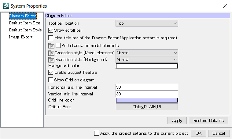
- Tool bar location
Choose where you want to have the Tool Palette.
Default [top]
- Show scroll bar
Check this option to display Scroll Bars.
Default [ON]
- Hide title bar of the Diagram Editor (Restarting Safilia is required)
Check this option to hide the title bar of editor frame. Restarting Safilia is required.
Default [OFF]
- Add shadow on model elements
Default [ON]
- Gradation style (Model elements)
Default [Diagonal]
- Gradation style (Background)
Default [Normal]
- Background color
Select color of background of Diagram Editor.
Default [White]
- Enable Suggest Feature
Check this option to enable the draw suggest feature.
Default [ON]
- Enable Content Assist
Check this option to enable the content assist feature.
Default [ON]
- Show Grid on diagram
Click this option to display the Grid on the Diagram Editor.
Default [OFF]
- Horizontal grid line interval
Set grid horizontal interval.
Default [30]
- Vertical grid line interval
Set grid vertical interval.
Default [30]
- Grid line color
Set grid color.
Default [Pale Purple]
- Default Font
Set Font Name, Font Style, Font Size.
Default [Dialog,PLAIN,16]
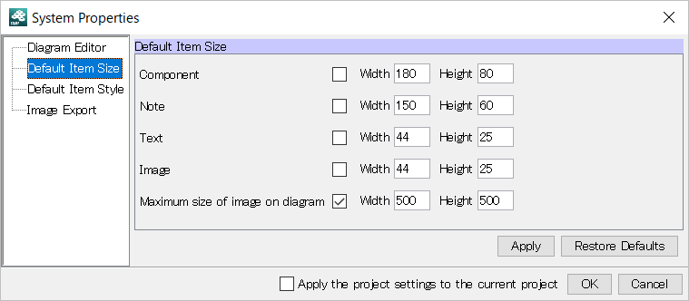
The Initial item size for each model elements can be set in this segment. To apply the size you input, check the box. “Maximum size of image on diagram” limits the maximum size of images on diagrams when the box of “Image” is unchecked.
Some models may appear in different size despite the size you specify depending on the length of its name etc Default size should be from 1 to 1000
Configure settings such as background color, line type and line width to be used when creating new elements.
To sync the settings of the project with the settings in the system properties, click [Project Settings] in the project properties.
When the project icon is displayed for certain diagram elements, the color settings for those elements are saved to each project that is created.
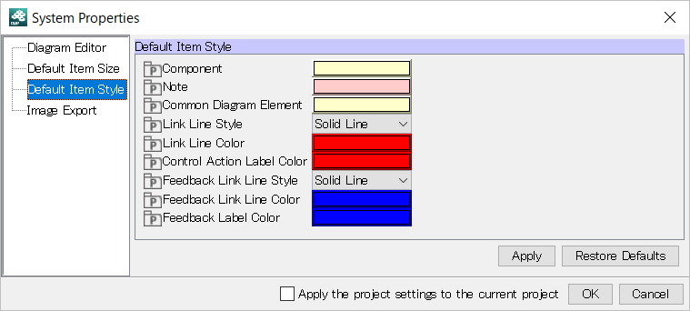
- Component
Set color to Component.
Default [Pale Yellow]
- Note
Set color to Note.
Default [Pink]
- Common Diagram Element
Set color to Common Diagram Element.
Default [Pale Yellow]
- Link Line Style
Set Link Line Style: Solid Line, Dashed Line.
Default [Solid Line]
- Link Line Color
Set color to Linke Line Color.
Default [Red]
- Control Action Label Color
Set color to Control Action Label Color.
Default [Red]
- Feedback Link Line Style
Set Feedback Link Line Style: Solid Line, Dashed Line.
Default [Solid Line]
- Feedback Link Line Color
Set color to Feedback Link Line Color.
Default [Blue]
- Feedback Label Color
Set font color to Feedback.
Default [Blue]
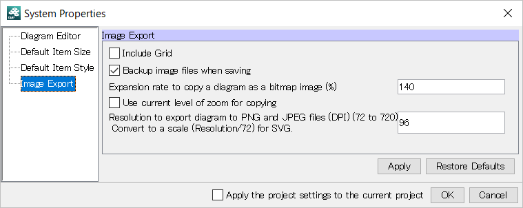
- Include Grid
Include grid to the exported image.
Default [OFF]
- Backup image files when saving
Create a buckup file if the file with the same name exist.
Default [ON]
- Expansion rate to copy a diagram as a bitmap image (%)
Set the expansion rate to copy a diagram as a bitmap image (%). (Minimum 100%)
Default [140]
- Use current level of zoom for copying
Click this option to use the zoom level of the screen for copy.
Default [OFF]
- Resolution to export a diagram to PNG and JPEG files (DPI) (72 to 720) Convert to a scale (Resolution/72) for SVG.
Default [96]